Individuals are not small groups, I: Simpson's paradox
By A. Solomon Kurz
October 9, 2019
tl;dr
If you are under the impression group-level data and group-based data analysis will inform you about within-person processes, you would be wrong. Stick around to learn why.
This is gonna be a long car ride.
Earlier this year I published a tutorial1 on a statistical technique that will allow you to analyze the multivariate time series data of a single individual. It’s called the dynamic p-technique. The method has been around since at least the 80s ( Molenaar, 1985) and its precursors date back to at least the 40s ( Cattell, Cattell, & Rhymer, 1947). In the age where it’s increasingly cheap and easy to collect data from large groups, on both one measurement occasion or over many, you might wonder why you should learn about a single-case statistical technique. Isn’t such a thing unneeded?
No. It is indeed needed. Unfortunately for me, the reasons we need it aren’t intuitive or well understood. Luckily for us all, I’m a patient man. We’ll be covering the reasons step by step. Once we’re done covering reasons, we’ll switch into full-blown tutorial mode. In this first blog on the topic, we’ll cover reason #1: Simpson’s paradox is a thing and it’ll bite you hard it you’re not looking for it.
Simpson’s paradox
Simpson’s paradox officially made its way into the literature in this 1951 paper by Simpson. Rather than define the paradox outright, I’m going to demonstrate it with a classic example. The data come from the 1973 University of California, Berkeley, graduate admissions. Based on a simple breakdown of the admission rates, 44% of the men who applied were admitted. In contrast, only 35% of the women who applied were admitted. The university was accused of sexism and the issue made its way into the courts.
However, when statisticians looked more closely at the data, it became apparent those data were not the compelling evidence of sexism they were initially made out to be. To see why, we’ll want to get into the data, ourselves. The admissions rates for the six largest departments have made their way into the peer-reviewed literature (
Bickel, Hammel, & O’Connell, 1975), into many textbooks (e.g., Danielle Navarro’s
Learning statistics with R), and are available in R as the built-in data set UCBAdmissions. Here we’ll call them, convert the data into a tidy format2, and add a variable.
library(tidyverse)

d <-
  UCBAdmissions %>%
  as_tibble() %>%
  pivot_wider(id_cols = c(Dept, Gender),
              names_from = Admit,
              values_from = n) %>%
  mutate(total = Admitted + Rejected)

head(d)
## # A tibble: 6 × 5
##   Dept  Gender Admitted Rejected total
##   <chr> <chr>     <dbl>    <dbl> <dbl>
## 1 A     Male        512      313   825
## 2 A     Female       89       19   108
## 3 B     Male        353      207   560
## 4 B     Female       17        8    25
## 5 C     Male        120      205   325
## 6 C     Female      202      391   593
The identities of the departments have been anonymized, so we’re stuck with referring to them as A through F. Much like with the overall rates for graduate admissions, it appears that the admission rates for the six anonymized departments in the UCBAdmissions data show higher a admission rate for men.
d %>%
  group_by(Gender) %>%
  summarise(percent_admitted = (100 * sum(Admitted) / sum(total)) %>% round(digits = 1))
## # A tibble: 2 × 2
##   Gender percent_admitted
##   <chr>             <dbl>
## 1 Female             30.4
## 2 Male               44.5
A 14% difference seems large enough to justify a stink. However, the plot thickens when we break the data down by department. For that, we’ll make a visual.
d %>%
  mutate(dept = str_c("department ", Dept)) %>%
  pivot_longer(cols = Admitted:Rejected,
               names_to = "admit",
               values_to = "n") %>%

  ggplot(aes(x = Gender, y = n, fill = admit)) +
  geom_col(position = "dodge") +
  scale_fill_viridis_d(NULL, option = "A", end = .6) +
  xlab(NULL) +
  theme(panel.grid = element_blank()) +
  facet_wrap(~dept)
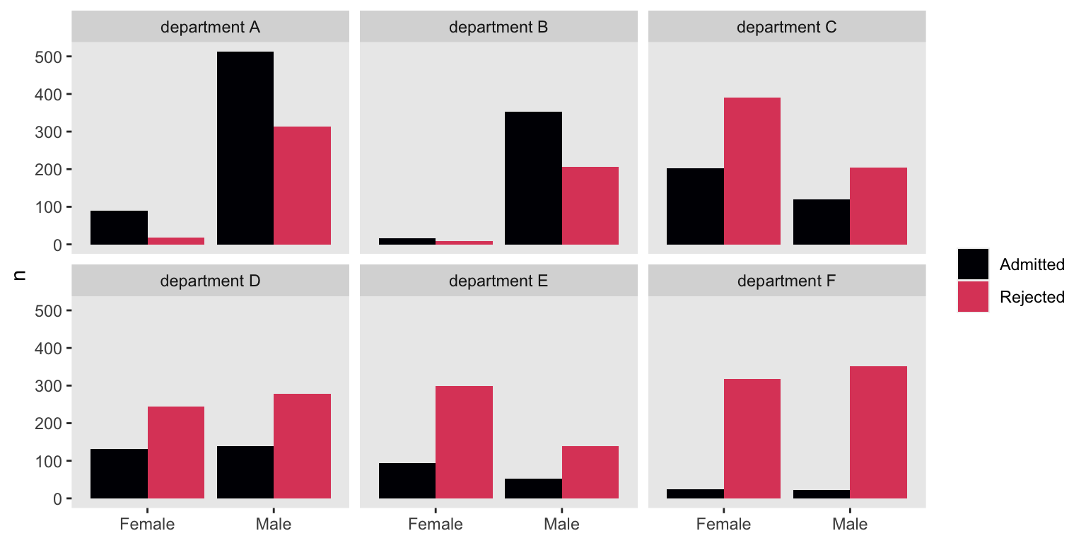
The problem with our initial analysis is it didn’t take into account how different departments might admit men/women at different rates. We also failed to consider whether men and women applied to those different departments at different rates. Take departments A and B. Both admitted the majority of applicants, regardless of gender. Now look at departments E and F. The supermajorities of applicants were rejected, both for men and women Also notice that whereas the departments where the supermajority of applicants were men (i.e., departments A and B) had generous admission rates, the departments with the largest proportion of women applicants (i.e., departments C and E) had rather high rejection rates.
It can be hard to juggle all this in your head at once, even with the aid of our figure. Let’s look at the data in a different way. This time we’ll summarize the admission rates in a probability metric where the probability of admission is n / total (i.e., the number of successes divided by the total number of trials). We’ll compute those probabilities while grouping by Gender and Dept.
d %>%
  mutate(p = Admitted / total) %>%

  ggplot(aes(x = Dept, y = p)) +
  geom_hline(yintercept = .5, color = "white") +
  geom_point(aes(color = Gender, size = total),
             position = position_dodge(width = 0.3)) +
  scale_color_manual(NULL, values = c("red3", "blue3")) +
  scale_y_continuous("admission probability", limits = 0:1) +
  xlab("department") +
  theme(panel.grid = element_blank())
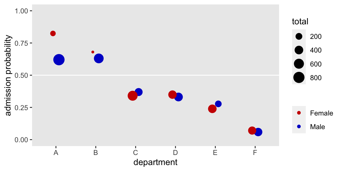
Several things pop out. For \(5/6\) of the departments (i.e., all but A), the admission probabilities were very similar for men and women–sometimes slightly higher for women, sometimes slightly higher for men. We also see a broad range overall admission rates across departments. Note how the dots are sized based on the total number of applications, by Gender and Dept. Hopefully those sizes help show how women disproportionately applied to departments with low overall admission probabilities. Interestingly, the department with the largest gender bias was A, which showed a bias towards admitting women at higher rates than men.
Let’s get formal. The paradox Simpson wrote about is that the simple association between two variables can disappear or even change sign when it is conditioned on a relevant third variable. The relevant third variable is typically a grouping variable. In the Berkeley admissions example, the seemingly alarming association between graduate admissions and gender disappeared when conditioned on department. If you’re still jarred by this, Navarro covered this in the opening chapter of her text. Richard McElreath covered it more extensively in chapters 10 and 13 of his (2015) text, Statistical Rethinking. I’ve also worked through a similar example of Simpson’s paradox from the more recent literature, here. Kievit, Frankenhuis, Waldorp, and Borsboom (2013) wrote a fine primer on the topic, too.
Wait. What?
At this point you might be wondering what this has to do with the difference between groups and individuals. We’re slowly building a case step by step, remember? For this first installment, just notice how a simple bivariate analysis fell apart once we took an important third variable into account. In this case and in many others, it so happened that third variable was a grouping variable.
Stay tuned for the next post where well build on this with a related phenomenon: the ecological fallacy.
Session info
sessionInfo()
## R version 4.2.0 (2022-04-22)
## Platform: x86_64-apple-darwin17.0 (64-bit)
## Running under: macOS Big Sur/Monterey 10.16
##
## Matrix products: default
## BLAS:   /Library/Frameworks/R.framework/Versions/4.2/Resources/lib/libRblas.0.dylib
## LAPACK: /Library/Frameworks/R.framework/Versions/4.2/Resources/lib/libRlapack.dylib
##
## locale:
## [1] en_US.UTF-8/en_US.UTF-8/en_US.UTF-8/C/en_US.UTF-8/en_US.UTF-8
##
## attached base packages:
## [1] stats     graphics  grDevices utils     datasets  methods   base
##
## other attached packages:
## [1] forcats_0.5.1   stringr_1.4.1   dplyr_1.0.10    purrr_0.3.4
## [5] readr_2.1.2     tidyr_1.2.1     tibble_3.1.8    ggplot2_3.4.0
## [9] tidyverse_1.3.2
##
## loaded via a namespace (and not attached):
##  [1] lubridate_1.8.0     assertthat_0.2.1    digest_0.6.30
##  [4] utf8_1.2.2          R6_2.5.1            cellranger_1.1.0
##  [7] backports_1.4.1     reprex_2.0.2        evaluate_0.18
## [10] highr_0.9           httr_1.4.4          blogdown_1.15
## [13] pillar_1.8.1        rlang_1.0.6         googlesheets4_1.0.1
## [16] readxl_1.4.1        rstudioapi_0.13     jquerylib_0.1.4
## [19] rmarkdown_2.16      labeling_0.4.2      googledrive_2.0.0
## [22] munsell_0.5.0       broom_1.0.1         compiler_4.2.0
## [25] modelr_0.1.8        xfun_0.35           pkgconfig_2.0.3
## [28] htmltools_0.5.3     tidyselect_1.1.2    bookdown_0.28
## [31] viridisLite_0.4.1   fansi_1.0.3         crayon_1.5.2
## [34] tzdb_0.3.0          dbplyr_2.2.1        withr_2.5.0
## [37] grid_4.2.0          jsonlite_1.8.3      gtable_0.3.1
## [40] lifecycle_1.0.3     DBI_1.1.3           magrittr_2.0.3
## [43] scales_1.2.1        cli_3.4.1           stringi_1.7.8
## [46] cachem_1.0.6        farver_2.1.1        fs_1.5.2
## [49] xml2_1.3.3          bslib_0.4.0         ellipsis_0.3.2
## [52] generics_0.1.3      vctrs_0.5.0         tools_4.2.0
## [55] glue_1.6.2          hms_1.1.1           fastmap_1.1.0
## [58] yaml_2.3.5          colorspace_2.0-3    gargle_1.2.0
## [61] rvest_1.0.2         knitr_1.40          haven_2.5.1
## [64] sass_0.4.2
Footnotes
-
You can find the preprint and supporting documents, including the data and code, here. ↩︎
-
Walking out the definition of tidy data is beyond the scope of this post. It’s connected to the work of data scientist Hadley Wickham, in particular, and the ethos behind the collection of R packages called the tidyverse, more generally. My R code tends to follow the tidyverse style. If you’re new these ideas, it’ll help if you familiarize yourself with them a bit. For an introduction to the notion of tidy data, Wickham’s recent talk, Data visualization and data science, is a fine place to start. ↩︎
- Posted on:
- October 9, 2019
- Length:
- 7 minute read, 1467 words