Just use multilevel models for your pre/post RCT data
By A. Solomon Kurz
June 13, 2022
Version 1.1.0
Edited on January 2, 2023, to acknowledge the related simulation study by O’Connell et al. ( 2017). See footnote #3 for details.
What?
If you’d like to study the effectiveness of a clinical treatment, one of the simplest and most widely used approaches it to
- recruit participants from the target population,
- measure the outcome variable during a pre-treatment assessment,
- randomly assign participants into
- a control condition or
- an experimental treatment condition,
- treat the participants in the treatment condition, and
- measure the outcome variable again at the conclusion of treatment.
You can describe this as a pre/post control group design, which in many settings we also call this a randomized controlled trial (RCT1). Although this design cannot return valid causal estimates of the treatment effect at the participant level, it can return a valid causal estimate of the average treatment effect, in the population2. In the methodological literature, the two most popular ways for estimating the average treatment effect are
- the simple change-score model and
- the so-called ANCOVA model.
Much of the discussion around these models has centered around nicely-behaved Gaussian-type data of the kind you’d analyze with OLS. For simplicity, we’ll stay close to that paradigm in this post. However, we’ve also benefited from the rise of multilevel models over the past few decades and it turns out both the change-score and ANCOVA models can be largely reproduced within a multilevel model framework.
The goal of this post is to introduce the change-score and ANCOVA models, introduce their multilevel-model counterparts, and compare their behavior in a couple quick simulation studies.
Spoiler alert: The multilevel variant of the ANCOVA model is the winner.
There may be disappointment.
I’m not going to dive deeply into the pre/post RCT methods literature, here. This post is an outgrowth of the many helpful exchanges in this twitter thread:
#RStats or otherwise, is there any good pedagogical material on analyzing pre/post experimental data with regression? I’m particularly interested in models that allow one to compute the difference (between groups) in differences (from pre to post).
— Solomon Kurz (@SolomonKurz) June 6, 2022
For your own deep dive into the topic, you could spiderweb out from any of the great resources listed in the thread. For me, the most influential papers on my thinking, and thus on this post, were by van Breukelen ( 2013) and Bodner & Bliese ( 2018).
I make assumptions.
You’ll want to be familiar with single-level and multilevel regression. For frequentist resources, I recommend the texts by Ismay & Kim ( 2022), Roback & Legler ( 2021), Hoffman ( 2015), or Singer & Willett ( 2003). For the Bayesians in the room, I recommend the texts by Gelman and colleagues ( 2020), McElreath ( 2020, 2015), or Kruschke ( 2015).
You should have a basic grounding in group-based experimental design. Given my background in clinical psychology, I recommend Shadish and colleagues’ ( 2002) Experimental and quasi-experimental designs for generalized causal inference or Kazdin’s ( 2017) Research design in clinical psychology. You might also check out Taback’s ( 2022) Design and analysis of experiments and observational studies using R and its free companion website at https://designexptr.org/index.html.
All code is in R ( R Core Team, 2022). The data were simulated with help from the faux package ( DeBruine, 2021), and the data wrangling and plotting relied heavily on the tidyverse ( Wickham et al., 2019; Wickham, 2022) and ggdist ( Kay, 2021). The multilevel models were fit with lme4 ( Bates et al., 2015, 2021), and we post-processed those models with help from the marginaleffects package ( Arel-Bundock, 2022). The guts of our simulation study also pull some functionality from the broom ( Robinson et al., 2022) and broom.mixed ( Bolker & Robinson, 2022) packages.
Load the primary R packages and adjust the global plotting theme.
# load
library(faux)
library(lme4)
library(ggplot2)
library(tibble)
library(dplyr)
library(tidyr)
library(stringr)
library(purrr)
library(ggdist)
library(marginaleffects)

# adjust the plotting theme
theme_set(
  theme_linedraw() +
  theme(panel.grid = element_blank(),
        strip.background = element_rect(fill = "grey92", color = "grey92"),
        strip.text = element_text(color = "black", size = 10))
)
We need data.
We’re going to be simulating a lot of data in this post, so we may as well start off with a custom data-simulating function. The sim_data() function will simulate pre/post outcome data for two equal-sized groups. Cases for which tx == 0 are like those in a static no-treatment control group and those for which tx == 1 are like those in an active treatment group. The pre and post outcome data follow a bivariate standard normal distribution for which the correlation is determined by the rho argument. The average causal effect in the treatment group is governed by the tau argument.
sim_data <- function(seed = 1, n = 100, tau = 1, rho = .5) {

  # population values
  m <- 0
  s <- 1

  # simulate and save
  set.seed(seed)

  rnorm_multi(
    n = n,
    mu = c(m, m),
    sd = c(s, s),
    r = rho,
    varnames = list("pre", "post")
  ) %>%
    mutate(tx = rep(0:1, each = n / 2)) %>%
    mutate(post = ifelse(tx == 1, post + tau, post))

}

# how does it work?
dw <- sim_data(seed = 1, n = 100, tau = 1, rho = .5)

# what is this?
head(dw)
##          pre        post tx
## 1 -0.2323416 -0.85270825  0
## 2  0.1379818  0.18009772  0
## 3 -0.2682148 -1.17913643  0
## 4  1.3025393  1.46056809  0
## 5  0.6126544 -0.04193022  0
## 6 -1.5941901  0.17309717  0
By using the default tau = 1, we have simulated sample data from which the population-level average treatment effect is in the metric of a Cohen’s \(d = 1\). The sim_data() function returns the data in the wide format, which will work fine for conventional single-level regression. Here we’ll convert the dw data to the long format, to accommodate the multilevel models.
dl <- dw %>%
  mutate(id = 1:n()) %>%
  pivot_longer(pre:post,
               names_to = "wave",
               values_to = "y") %>%
  mutate(time = ifelse(wave == "pre", 0, 1))

# what is this?
head(dl)
## # A tibble: 6 × 5
##      tx    id wave       y  time
##   <int> <int> <chr>  <dbl> <dbl>
## 1     0     1 pre   -0.232     0
## 2     0     1 post  -0.853     1
## 3     0     2 pre    0.138     0
## 4     0     2 post   0.180     1
## 5     0     3 pre   -0.268     0
## 6     0     3 post  -1.18      1
Now the outcome variable y is measured on the two levels of time and the synthetic participants are indexed in the id column. With the data in the long format, here are what the participant-level data and their group means look like, over time.
dl %>%
  ggplot(aes(x = time, y = y)) +
  geom_line(aes(group = id),
            linewidth = 1/4, alpha = 3/4) +
  stat_smooth(method = "lm", se = F, linewidth = 3, formula = y ~ x) +
  scale_x_continuous(breaks = 0:1, labels = c("0 (pre)", "1 (post)"), expand = c(0.1, 0.1)) +
  scale_y_continuous(sec.axis = dup_axis(name = NULL)) +
  ggtitle(expression("100 draws from the population for which "*tau==1)) +
  facet_wrap(~ tx, labeller = label_both)
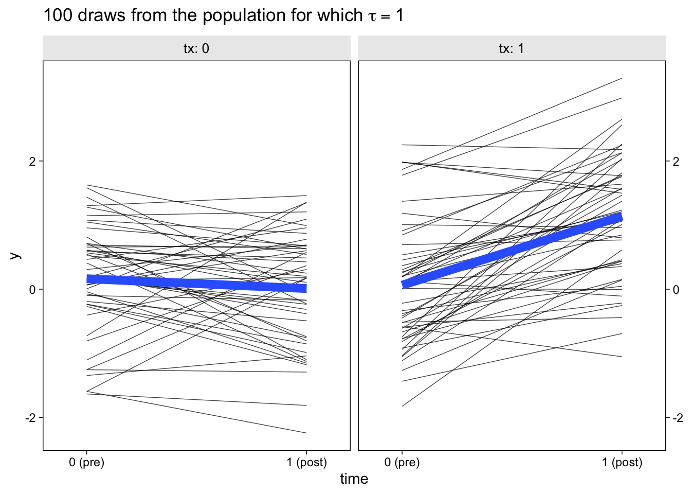
The thin semi-transparent black lines in the background are the synthetic participant-level data. The bold blue lines in the foreground are the group averages.
Models
First we’ll fit the two conventional single-level models. Then we’ll fit their multilevel analogues. For simplicity, we’ll be using a frequentist paradigm throughout this post.
Single level models.
The simple change-score model follows the formula
$$
\begin{align*} \text{post}_i - \text{pre}_i & \sim \mathcal N(\mu_i, \sigma_\epsilon) \\ \mu_i & = \beta_0 + {\color{red}{\beta_1}} \text{tx}_i, \end{align*}
$$
where the outcome variable is the difference in the pre and post variables. In software, you can compute and save this as a change-score variable in the data frame, or you can specify pre - post directly in the glm() function. The \(\beta_0\) parameter is the population mean for the change in the control group. The \(\beta_1\) parameter is the population level difference in pre/post change in the treatment group, compared to the control group. From a causal inference perspective, the \(\beta_1\) parameter is also the average treatment effect in the population, which we’ve been calling \(\tau\).
The terribly-named ANCOVA model follows the formula
$$
\begin{align*} \text{post}_i & \sim \mathcal N(\mu_i, \sigma_\epsilon) \\ \mu_i & = \beta_0 + {\color{red}{\beta_1}} \text{tx}_i + \beta_2 \text{pre}_i, \end{align*}
$$
where the outcome variable is now just post. As a consequence, \(\beta_0\) is now the population mean for the outcome variable in the control group and \(\beta_1\) is the population level difference in post in the treatment group, compared to the control group. But because we’ve added pre as a covariate, both \(\beta_0\) and \(\beta_1\) are conditional on the outcome variable, as collected at baseline before random assignment. But just like with the simple change-score model, the \(\beta_1\) parameter is still an estimate for the average treatment effect in the population, \(\tau\). As is typically the case with regression, the model intercept \(\beta_0\) will be easier to interpret if the covariate pre is mean centered. Since we simulated our data to be in the standardized metric, we won’t have to worry about that, here.
Here’s how use the glm() function to fit both models with maximum likelihood estimation.
w1 <- glm(
  data = dw,
  family = gaussian,
  (post - pre) ~ 1 + tx)

w2 <- glm(
  data = dw,
  family = gaussian,
  post ~ 1 + tx + pre)
We might review their summaries.
summary(w1)
##
## Call:
## glm(formula = (post - pre) ~ 1 + tx, family = gaussian, data = dw)
##
## Deviance Residuals:
##     Min       1Q   Median       3Q      Max
## -1.7619  -0.5126  -0.1191   0.5642   2.2397
##
## Coefficients:
##             Estimate Std. Error t value Pr(>|t|)
## (Intercept)  -0.1525     0.1352  -1.128    0.262
## tx            1.2294     0.1912   6.431 4.64e-09 ***
## ---
## Signif. codes:  0 '***' 0.001 '**' 0.01 '*' 0.05 '.' 0.1 ' ' 1
##
## (Dispersion parameter for gaussian family taken to be 0.9134756)
##
##     Null deviance: 127.303  on 99  degrees of freedom
## Residual deviance:  89.521  on 98  degrees of freedom
## AIC: 278.72
##
## Number of Fisher Scoring iterations: 2
summary(w2)
##
## Call:
## glm(formula = post ~ 1 + tx + pre, family = gaussian, data = dw)
##
## Deviance Residuals:
##      Min        1Q    Median        3Q       Max
## -1.89775  -0.62342  -0.06044   0.56783   1.79228
##
## Coefficients:
##             Estimate Std. Error t value Pr(>|t|)
## (Intercept) -0.06354    0.11674  -0.544    0.587
## tx           1.17483    0.16403   7.163 1.54e-10 ***
## pre          0.45511    0.09019   5.046 2.11e-06 ***
## ---
## Signif. codes:  0 '***' 0.001 '**' 0.01 '*' 0.05 '.' 0.1 ' ' 1
##
## (Dispersion parameter for gaussian family taken to be 0.6705727)
##
##     Null deviance: 114.002  on 99  degrees of freedom
## Residual deviance:  65.046  on 97  degrees of freedom
## AIC: 248.78
##
## Number of Fisher Scoring iterations: 2
In both models, the \(\beta_1\) estimates (the tx lines in the output) are just a little above the data-generating population value tau = 1. More importantly, notice how they have different point estimates and standard errors. Which is better? Methodologists have spilled a lot of ink on that topic…
Multilevel models.
The multilevel variant of the simple change-score model follows the formula
$$
\begin{align*} y_{it} & \sim \mathcal N(\mu_{it}, \sigma_\epsilon) \\ \mu_{it} & = \beta_0 + \beta_1 \text{tx}_{it} + \beta_2 \text{time}_{it} + {\color{red}{\beta_3}} \text{tx}_{it}\text{time}_{it} + u_{0i} \\ u_{0i} & \sim \mathcal N(0, \sigma_0), \end{align*}
$$
where now the outcome variable y varies across \(i\) participants and \(t\) time points. \(\beta_0\) is the population mean at baseline for the control group and \(\beta_1\) is the difference in the treatment group at baseline, compared to the control. The \(\beta_2\) coefficient is the change over time for the control group and \(\beta_3\) is the time-by-treatment interaction, which is also the same as the average treatment effect in the population, \(\tau\). Because there are only two time points, we cannot have both random intercepts and time-slopes. However, the model does account for participant-level deviations around the baseline grand mean via the \(u_{0i}\) term, which is modeled as normally distributed with a mean of zero and a standard deviation \(\sigma_0\), which we estimate as part of the model.
The multilevel variant of the ANCOVA model follows the formula
$$
\begin{align*} y_{it} & \sim \mathcal N(\mu_{it}, \sigma_\epsilon) \\ \mu_{it} & = \beta_0 + \beta_1 \text{time}_{it} + {\color{red}{\beta_2}} \text{tx}_{it}\text{time}_{it} + u_{0i} \\ u_{0i} & \sim \mathcal N(0, \sigma_0), \end{align*}
$$
where most of the model is the same as the previous one, but with the omission of a lower-level \(\beta\) coefficient for the tx variable. By only including tx in an interaction with time, the \(\beta_0\) coefficient now becomes a common mean for both experimental conditions at baseline. This is methodologically justified because the baseline measurements were taken before groups were randomized into experimental conditions, which effectively means all participants were drawn from the same population at that point. As a consequence, \(\beta_1\) is now the population-average change in the outcome for those in the control condition, relative to the grand mean at baseline, and \(\beta_2\) is the average treatment effect in the population, \(\tau\).
Here’s how use the lmer() function to fit both models with restricted maximum likelihood estimation.
# fit
l1 <- lmer(
  data = dl,
  y ~ 1 + tx + time + tx:time + (1 | id))

l2 <- lmer(
  data = dl,
  y ~ 1 + time + tx:time + (1 | id))

# summarize
summary(l1)
## Linear mixed model fit by REML ['lmerMod']
## Formula: y ~ 1 + tx + time + tx:time + (1 | id)
##    Data: dl
##
## REML criterion at convergence: 514.8
##
## Scaled residuals:
##      Min       1Q   Median       3Q      Max
## -1.92806 -0.62115  0.03663  0.52089  1.82216
##
## Random effects:
##  Groups   Name        Variance Std.Dev.
##  id       (Intercept) 0.3828   0.6187
##  Residual             0.4567   0.6758
## Number of obs: 200, groups:  id, 100
##
## Fixed effects:
##             Estimate Std. Error t value
## (Intercept)   0.1632     0.1296   1.260
## tx           -0.1001     0.1833  -0.546
## time         -0.1525     0.1352  -1.128
## tx:time       1.2294     0.1912   6.431
##
## Correlation of Fixed Effects:
##         (Intr) tx     time
## tx      -0.707
## time    -0.522  0.369
## tx:time  0.369 -0.522 -0.707
summary(l2)
## Linear mixed model fit by REML ['lmerMod']
## Formula: y ~ 1 + time + tx:time + (1 | id)
##    Data: dl
##
## REML criterion at convergence: 513.5
##
## Scaled residuals:
##      Min       1Q   Median       3Q      Max
## -1.93249 -0.62147  0.04002  0.54235  1.82449
##
## Random effects:
##  Groups   Name        Variance Std.Dev.
##  id       (Intercept) 0.3801   0.6165
##  Residual             0.4558   0.6752
## Number of obs: 200, groups:  id, 100
##
## Fixed effects:
##             Estimate Std. Error t value
## (Intercept)  0.11320    0.09143   1.238
## time        -0.12520    0.12549  -0.998
## time:tx      1.17479    0.16286   7.213
##
## Correlation of Fixed Effects:
##         (Intr) time
## time    -0.397
## time:tx  0.000 -0.649
Now our estimates for \(\tau\) are listed in the tx:time rows of the summary() output.
But which one is the best? Simulation study
We might run a little simulation study3 to compare these four methods across several simulated data sets. To run the sim, we’ll need to extend our sim_data() function to a sim_fit() function. The first parts of the sim_fit() function are the same as with sim_data(). But this time, the function internally makes both wide and long versions of the data, fits all four models to the data, and extracts the summary results for the four versions of \(\tau\).
sim_fit <- function(seed = 1, n = 100, tau = 1, rho = .5) {

  # population values
  m <- 0
  s <- 1

  # simulate wide
  set.seed(seed)

  dw <-
    rnorm_multi(
      n = n,
      mu = c(m, m),
      sd = c(s, s),
      r = rho,
      varnames = list("pre", "post")
    ) %>%
    mutate(tx = rep(0:1, each = n / 2)) %>%
    mutate(post = ifelse(tx == 1, post + tau, post))

  # make long
  dl <- dw %>%
    mutate(id = 1:n()) %>%
    pivot_longer(pre:post,
                 names_to = "wave",
                 values_to = "y") %>%
    mutate(time = ifelse(wave == "pre", 0, 1))

  # fit the models
  w1 <- glm(
    data = dw,
    family = gaussian,
    (post - pre) ~ 1 + tx)

  w2 <- glm(
    data = dw,
    family = gaussian,
    post ~ 1 + pre + tx)

  l1 <- lmer(
    data = dl,
    y ~ 1 + tx + time + tx:time + (1 | id))

  l2 <- lmer(
    data = dl,
    y ~ 1 + time + tx:time + (1 | id))

  # summarize
  bind_rows(
    broom::tidy(w1)[2, 2:4],
    broom::tidy(w2)[3, 2:4],
    broom.mixed::tidy(l1)[4, 4:6],
    broom.mixed::tidy(l2)[3, 4:6]) %>%
    mutate(method = rep(c("glm()", "lmer()"), each = 2),
           model = rep(c("change", "ANCOVA"), times = 2))

}
Here’s how it works out of the box.
sim_fit()
## # A tibble: 4 × 5
##   estimate std.error statistic method model
##      <dbl>     <dbl>     <dbl> <chr>  <chr>
## 1     1.23     0.191      6.43 glm()  change
## 2     1.17     0.164      7.16 glm()  ANCOVA
## 3     1.23     0.191      6.43 lmer() change
## 4     1.17     0.163      7.21 lmer() ANCOVA
Each estimate of \(\tau\) is indexed by the function we used to fit the model (single-level with glm() or multilevel with lmer()) and by which conceptual model was used (the change-score model or the ANCOVA model).
I’m going to keep the default settings at n = 100 and tau = 1. We will run many iterations with different values for seed. To help shake out a subtle point, we’ll use two levels of rho. We’ll make 1,000 iterations with rho = .4 and another 1,000 iterations with rho = .8.
# rho = .4
sim.4 <- tibble(seed = 1:1000) %>%
  mutate(tidy = map(seed, sim_fit, rho = .4)) %>%
  unnest(tidy)

# rho = .8
sim.8 <- tibble(seed = 1:1000) %>%
  mutate(tidy = map(seed, sim_fit, rho = .8)) %>%
  unnest(tidy)
On my 2-year-old laptop, each simulation took about a minute and a half. Your mileage may vary.
The first question we might ask is: How well did the different model types do with respect to parameter bias? That is, how close are the point estimates to the data generating value \(\tau = 1\) and do they, on average, converge to the data generating value? Here are the results in a dot plot.
bind_rows(
  sim.4 %>% mutate(rho = .4),
  sim.8 %>% mutate(rho = .8)) %>%
  mutate(type = str_c(model, ", ", method),
         rho = str_c("rho==", rho)) %>%

  ggplot(aes(x = estimate, y = type, slab_color = after_stat(x), slab_fill = after_stat(x))) +
  geom_vline(xintercept = 1, color = "grey67") +
  stat_dotsinterval(.width = .5, slab_shape = 22) +
  labs(title = expression("Parameter bias by model, algorithm, and pre/post correlation "*(rho)),
       x = expression(hat(tau)*" (causal effect point estimate)"),
       y = NULL) +
  scale_slab_fill_continuous(limits = c(0, NA)) +
  scale_slab_color_continuous(limits = c(0, NA)) +
  coord_cartesian(ylim = c(1.4, NA)) +
  theme(axis.text.y = element_text(hjust = 0),
        legend.position = "none") +
  facet_wrap(~ rho, labeller = label_parsed)
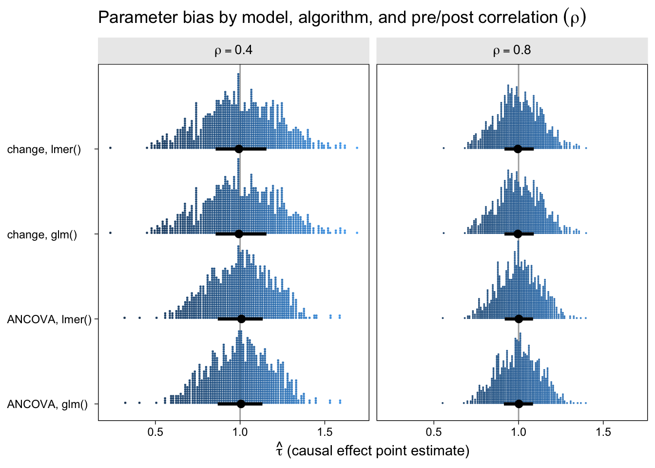
With out dot-plot method, each little blue square is one of the simulation iterations. The black dots and horizontal lines at the base of the distributions are the medians and interquartile ranges. Unbiased models will tend toward 1 and happily, all of our models appear unbiased, even regardless of \(\rho\). This is great! It means that no matter which of our four models you go with, it will be an unbiased estimator of the population average treatment effect. However, two important trends emerged. First, both variants of the ANCOVA model tended to have less spread around the true data-generating value–their estimates are less noisy. Second, on the whole, the models have less spread for higher values of \(\rho\).
Now let’s look at the results from the perspective of estimation efficiency.
bind_rows(
  sim.4 %>% mutate(rho = .4),
  sim.8 %>% mutate(rho = .8)) %>%
  mutate(type = str_c(model, ", ", method),
         rho = str_c("rho==", rho)) %>%

  ggplot(aes(x = std.error, y = type, slab_color = after_stat(x), slab_fill = after_stat(x))) +
  stat_dotsinterval(.width = .5, slab_shape = 22) +
  labs(title = expression("Parameter efficiency by model, algorithm, and pre/post correlation "*(rho)),
       x = expression(tau[s.e.]*" (causal effect standard error)"),
       y = NULL) +
  scale_slab_fill_continuous(limits = c(0, NA)) +
  scale_slab_color_continuous(limits = c(0, NA)) +
  coord_cartesian(ylim = c(1.4, NA)) +
  theme(axis.text.y = element_text(hjust = 0),
        legend.position = "none") +
  facet_wrap(~ rho, labeller = label_parsed)
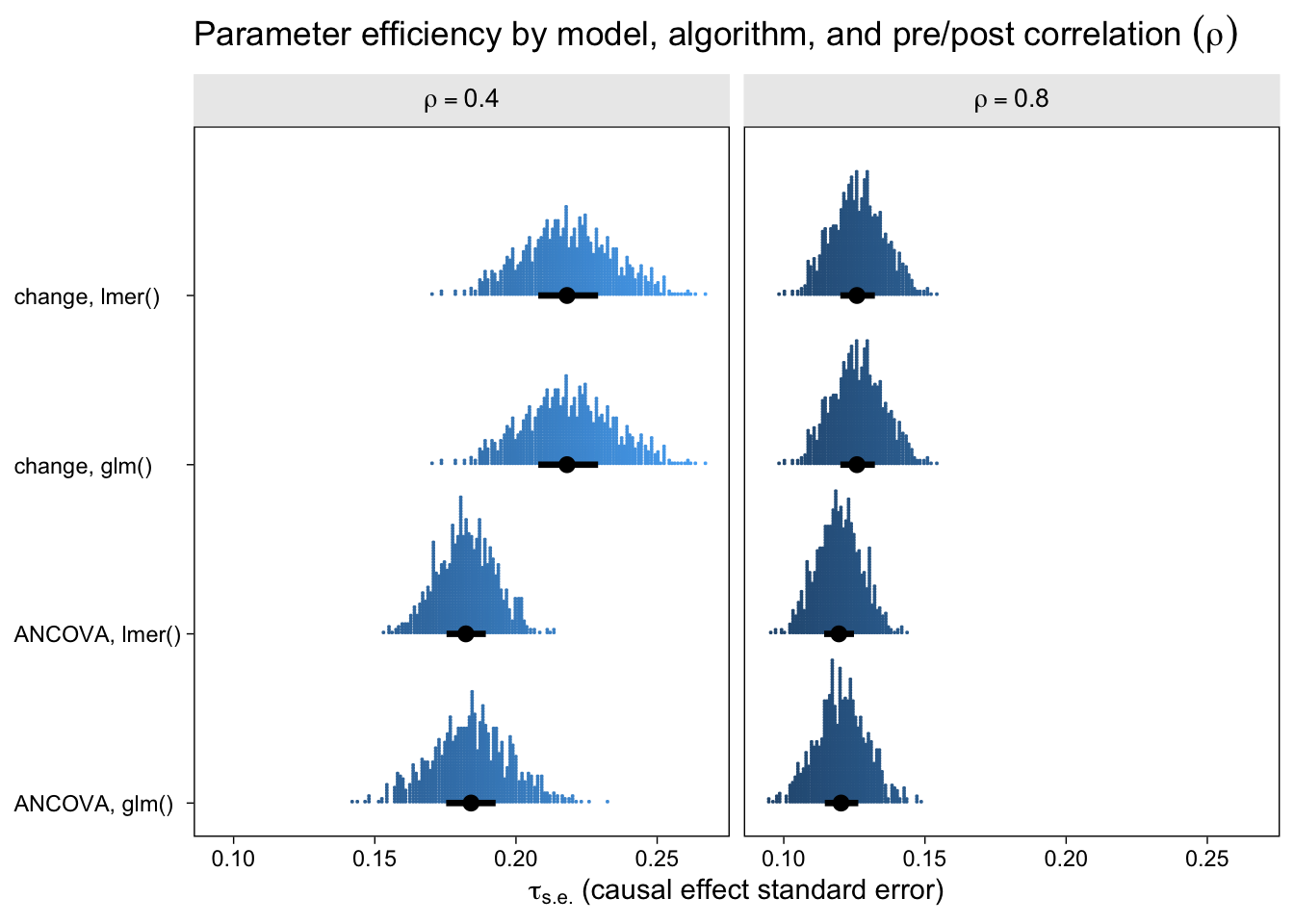
To my eye, three patterns emerged. First, the ANCOVA models were more efficient (i.e., had lower standard errors) than the change-score models AND the multilevel version of the ANCOVA model is slightly more efficient than the conventional single-level ANCOVA. Second, the models were more efficient, on the whole, for larger values of \(\rho\). Third, the differences in efficiency among the models were less apparent for larger values of \(\rho\), which is not surprising because the methodological literature has shown that the change-score and ANCOVA models converge as \(\rho \rightarrow 1\). That’s a big part of the whole Lord’s-paradox discourse I’ve completely sidelined because, frankly, I find it uninteresting.
If you look very closely at both plots, there’s one more pattern to see. For each level of \(\rho\), the results from the single-level and multilevel versions of the change-score model are identical. Though not as obvious, the results from the the single-level and multilevel versions of the ANCOVA model model are generally different, but very close. To help clarify, let’s look at a few Pearson’s correlation coefficients.
bind_rows(
  sim.4 %>% mutate(rho = .4),
  sim.8 %>% mutate(rho = .8)) %>%
  select(-statistic) %>%
  pivot_longer(estimate:std.error, names_to = "result") %>%
  pivot_wider(names_from = "method", values_from = value) %>%
  group_by(model, result, rho) %>%
  summarise(correlation = cor(`glm()`, `lmer()`))
## # A tibble: 8 × 4
## # Groups:   model, result [4]
##   model  result      rho correlation
##   <chr>  <chr>     <dbl>       <dbl>
## 1 ANCOVA estimate    0.4       0.999
## 2 ANCOVA estimate    0.8       0.997
## 3 ANCOVA std.error   0.4       0.769
## 4 ANCOVA std.error   0.8       0.903
## 5 change estimate    0.4       1
## 6 change estimate    0.8       1
## 7 change std.error   0.4       1.00
## 8 change std.error   0.8       1.00
For each level of \(\rho\), the correlations between the point estimates and the standard errors are 1 for the change-score models (single-level compared with multilevel). Even though their statistical formulas and R-function syntax look different, the single-level and multilevel versions of the change-score model are equivalent. For the ANCOVA models, the correlations are \(\gt .99\) between the point estimates in the single-level and multilevel versions, for each level of \(\rho\), but they are a bit lower for the standard errors. So the conventional single-level ANCOVA model is not completely reproduced by its multilevel counterpart. But the two are very close and the results of this mini simulation study suggest the multilevel version is slightly better with respect to parameter bias and efficiency.
I prefer the multilevel change-score and ANCOVA models
Parameter bias and efficiency with respect to the causal estimate \(\tau\) are cool and all, but they’re not the only things to consider when choosing your analytic strategy. One of the things I love about the multilevel strategies is they both return estimates and 95% intervals for the population means at both time points for both conditions. For example, here’s how to compute those estimates from the multilevel ANCOVA model with the handy marginaleffects::predictions() function.
nd <- crossing(time = 0:1,
               tx   = 0:1) %>%
  mutate(id = "new")

predictions(l2,
            include_random = FALSE,
            newdata = nd,
            # yes, this makes a difference
            vcov = "kenward-roger") %>%
  select(time, tx, predicted, conf.low, conf.high)
##   time tx  predicted    conf.low conf.high
## 1    0  0  0.1132033 -0.06733426 0.2937408
## 2    0  1  0.1132033 -0.06733426 0.2937408
## 3    1  0 -0.0120005 -0.25432138 0.2303204
## 4    1  1  1.1627909  0.92046998 1.4051118
Did you notice how we computed those 95% confidence intervals with the ultra sweet Kenward-Roger method (see Kuznetsova et al., 2017; Luke, 2017)? It’s enough to make a boy giggle. But what would I do with these estimates?, you may wonder. You can display the results of your model in a plot (see McCabe et al., 2018)! Here’s what that could look like with the results from both the multilevel change-model and the multilevel ANCOVA.
bind_rows(
  # multilevel change-score
  predictions(l1,
              include_random = FALSE,
              newdata = nd,
              vcov = "kenward-roger"),
  # multilevel ANCOVA
  predictions(l2,
              include_random = FALSE,
              newdata = nd,
              vcov = "kenward-roger")) %>%
  mutate(model = rep(c("change-score", "ANCOVA"), each = n() / 2)) %>%
  mutate(model = factor(model,
                        levels = c("change-score", "ANCOVA"),
                        labels = c("change-score\ny ~ 1 + tx + time + tx:time + (1 | id)",
                                   "ANCOVA\ny ~ 1 + time + tx:time + (1 | id)")),
         tx    = factor(tx, levels = 1:0)) %>%

  ggplot(aes(x = time, y = predicted, ymin = conf.low, ymax = conf.high, fill = tx, color = tx)) +
  geom_ribbon(alpha = 1/3, linewidth = 0) +
  geom_line(linewidth = 1) +
  scale_fill_viridis_d(end = .6) +
  scale_color_viridis_d(end = .6) +
  scale_x_continuous(breaks = 0:1, labels = c("0 (pre)", "1 (post)"), expand = c(0.1, 0.1)) +
  scale_y_continuous("y", sec.axis = dup_axis(name = NULL)) +
  ggtitle("Population-mean trajectories via the multilevel models",
          subtitle = "The lines are the point estimates and the ribbons the Kenward-Roger-based 95% CIs.") +
  facet_wrap(~ model)
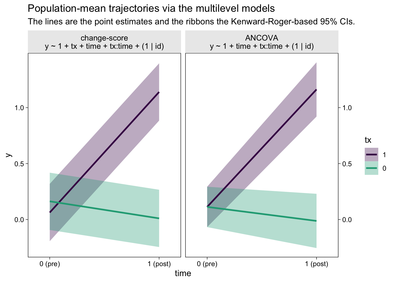
The big difference between the two models is how they handled the first time point, the baseline assessment. The multilevel change-score model allowed the two conditions to have separate means. The multilevel ANCOVA, however, pooled the information from all participants to estimate a grand mean for the baseline assessment. This is methodologically justified, remember, because the baseline assessment occurs before random assignment to condition in a proper RCT. As a consequence, all participants are part of a common population at that point. Whether you like the change-score or ANCOVA approach, it’s only the multilevel framework that will allow you to plot the inferences of the model, this way.
Among clinicians (e.g., my friends in clinical psychology), a natural question to ask is: How much did the participants change in each condition? The multilevel models also give us a natural way to quantify the population average change in each condition, along with high-quality 95% intervals. Here’s how to use marginaleffects::comparisons() to return those values.
# multilevel change-score
comparisons(l1,
            variables = list(time = 0:1),
            by = "tx",
            re.form = NA) %>%
  summary()
##   Term          Contrast tx  Effect Std. Error z value   Pr(>|z|)   2.5 %
## 1 time mean(1) - mean(0)  0 -0.1525     0.1352  -1.128    0.25926 -0.4174
## 2 time mean(1) - mean(0)  1  1.0769     0.1352   7.967 1.6246e-15  0.8120
##   97.5 %
## 1 0.1124
## 2 1.3418
##
## Model type:  lmerMod
## Prediction type:  response
# multilevel ANCOVA
comparisons(l2,
            variables = list(time = 0:1),
            by = "tx",
            re.form = NA) %>%
  summary()
##   Term          Contrast tx  Effect Std. Error z value Pr(>|z|)   2.5 % 97.5 %
## 1 time mean(1) - mean(0)  0 -0.1252     0.1255 -0.9977  0.31842 -0.3712 0.1208
## 2 time mean(1) - mean(0)  1  1.0496     0.1255  8.3638  < 2e-16  0.8036 1.2955
##
## Model type:  lmerMod
## Prediction type:  response
If you divide these pre-post differences by the pooled standard deviation at baseline, you’ll have the condition-specific Cohen’s \(d\) effect sizes (see
Feingold, 2009). We already have that for the differences between conditions. That’s what we’ve been calling \(\tau\); that is, \(\tau\) is the difference in differences.
There are other reasons to prefer the multilevel framework. With multilevel software, you can accommodate missing values with full-information estimation. It’s also just one small step further to adopt a generalized linear mixed model framework for all your non-Gaussian data needs. But those are fine topics for another day.
Wrap it up
In this post, some of the high points we covered were:
- The simple change-score and ANCOVA models are the two popular approaches for analyzing pre/post RCT data.
- Though both approaches are typically used with a single-level OLS-type paradigm, they both have clear multilevel counterparts.
- The single-level and multilevel versions of both change-score and ANCOVA models are all unbiased.
- The ANCOVA models tend to be more efficient than the change-score models.
- Only the multilevel versions of the models allow researchers to plot the results of the model.
- The multilevel versions of the models allow researchers to express the results of the models in terms of change for both conditions.
This post helped me clarify my thoughts on these models, and I hope you found some benefit, too. Happy modeling, friends.
Session info
sessionInfo()
## R version 4.2.0 (2022-04-22)
## Platform: x86_64-apple-darwin17.0 (64-bit)
## Running under: macOS Big Sur/Monterey 10.16
##
## Matrix products: default
## BLAS:   /Library/Frameworks/R.framework/Versions/4.2/Resources/lib/libRblas.0.dylib
## LAPACK: /Library/Frameworks/R.framework/Versions/4.2/Resources/lib/libRlapack.dylib
##
## locale:
## [1] en_US.UTF-8/en_US.UTF-8/en_US.UTF-8/C/en_US.UTF-8/en_US.UTF-8
##
## attached base packages:
## [1] stats     graphics  grDevices utils     datasets  methods   base
##
## other attached packages:
##  [1] marginaleffects_0.7.0.9001 ggdist_3.2.0
##  [3] purrr_0.3.4                stringr_1.4.1
##  [5] tidyr_1.2.1                dplyr_1.0.10
##  [7] tibble_3.1.8               ggplot2_3.4.0
##  [9] lme4_1.1-31                Matrix_1.4-1
## [11] faux_1.1.0
##
## loaded via a namespace (and not attached):
##  [1] sass_0.4.2           viridisLite_0.4.1    jsonlite_1.8.3
##  [4] splines_4.2.0        bslib_0.4.0          assertthat_0.2.1
##  [7] distributional_0.3.1 highr_0.9            broom.mixed_0.2.9.4
## [10] yaml_2.3.5           globals_0.16.0       numDeriv_2016.8-1.1
## [13] pillar_1.8.1         backports_1.4.1      lattice_0.20-45
## [16] glue_1.6.2           digest_0.6.30        checkmate_2.1.0
## [19] minqa_1.2.5          colorspace_2.0-3     htmltools_0.5.3
## [22] pkgconfig_2.0.3      broom_1.0.1          listenv_0.8.0
## [25] bookdown_0.28        scales_1.2.1         mgcv_1.8-40
## [28] generics_0.1.3       farver_2.1.1         ellipsis_0.3.2
## [31] cachem_1.0.6         withr_2.5.0          furrr_0.3.1
## [34] pbkrtest_0.5.1       cli_3.4.1            magrittr_2.0.3
## [37] evaluate_0.18        fansi_1.0.3          future_1.27.0
## [40] parallelly_1.32.1    nlme_3.1-159         MASS_7.3-58.1
## [43] forcats_0.5.1        blogdown_1.15        tools_4.2.0
## [46] data.table_1.14.2    lifecycle_1.0.3      munsell_0.5.0
## [49] compiler_4.2.0       jquerylib_0.1.4      rlang_1.0.6
## [52] grid_4.2.0           nloptr_2.0.3         rstudioapi_0.13
## [55] labeling_0.4.2       rmarkdown_2.16       boot_1.3-28
## [58] gtable_0.3.1         codetools_0.2-18     lmerTest_3.1-3
## [61] DBI_1.1.3            R6_2.5.1             knitr_1.40
## [64] fastmap_1.1.0        utf8_1.2.2           insight_0.18.8
## [67] stringi_1.7.8        parallel_4.2.0       Rcpp_1.0.9
## [70] vctrs_0.5.0          tidyselect_1.1.2     xfun_0.35
References
Arel-Bundock, V. (2022). marginaleffects: Marginal effects, marginal means, predictions, and contrasts [Manual]. [https://vincentarelbundock.github.io/ marginaleffects/ https://github.com/vincentarelbundock/ marginaleffects]( https://vincentarelbundock.github.io/ marginaleffects/ https://github.com/vincentarelbundock/ marginaleffects)
Bates, D., Mächler, M., Bolker, B., & Walker, S. (2015). Fitting linear mixed-effects models using lme4. Journal of Statistical Software, 67(1), 1–48. https://doi.org/10.18637/jss.v067.i01
Bates, D., Maechler, M., Bolker, B., & Steven Walker. (2021). lme4: Linear mixed-effects models using Eigen’ and S4. https://CRAN.R-project.org/package=lme4
Bodner, T. E., & Bliese, P. D. (2018). Detecting and differentiating the direction of change and intervention effects in randomized trials. Journal of Applied Psychology, 103(1), 37. https://doi.org/10.1037/apl0000251
Bolker, B., & Robinson, D. (2022). broom.mixed: Tidying methods for mixed models [Manual]. https://github.com/bbolker/broom.mixed
DeBruine, L. (2021). faux: Simulation for factorial designs [Manual]. https://github.com/debruine/faux
Feingold, A. (2009). Effect sizes for growth-modeling analysis for controlled clinical trials in the same metric as for classical analysis. Psychological Methods, 14(1), 43. https://doi.org/10.1037/a0014699
Gelman, A., Hill, J., & Vehtari, A. (2020). Regression and other stories. Cambridge University Press. https://doi.org/10.1017/9781139161879
Hoffman, L. (2015). Longitudinal analysis: Modeling within-person fluctuation and change (1 edition). Routledge. https://www.routledge.com/Longitudinal-Analysis-Modeling-Within-Person-Fluctuation-and-Change/Hoffman/p/book/9780415876025
Ismay, C., & Kim, A. Y. (2022). Statistical inference via data science; A moderndive into R and the tidyverse. https://moderndive.com/
Kay, M. (2021). ggdist: Visualizations of distributions and uncertainty [Manual]. https://CRAN.R-project.org/package=ggdist
Kazdin, A. E. (2017). Research design in clinical psychology, 5th Edition. Pearson. https://www.pearson.com/
Kruschke, J. K. (2015). Doing Bayesian data analysis: A tutorial with R, JAGS, and Stan. Academic Press. https://sites.google.com/site/doingbayesiandataanalysis/
Kuznetsova, A., Brockhoff, P. B., & Christensen, R. H. (2017). lmerTest package: Tests in linear mixed effects models. Journal of Statistical Software, 82(13), 1–26. https://doi.org/10.18637/jss.v082.i13
Luke, S. G. (2017). Evaluating significance in linear mixed-effects models in R. Behavior Research Methods, 49(4), 1494–1502. https://doi.org/10.3758/s13428-016-0809-y
McCabe, C. J., Kim, D. S., & King, K. M. (2018). Improving present practices in the visual display of interactions. Advances in Methods and Practices in Psychological Science, 1(2), 147–165. https://doi.org/10.1177/2515245917746792
McElreath, R. (2020). Statistical rethinking: A Bayesian course with examples in R and Stan (Second Edition). CRC Press. https://xcelab.net/rm/statistical-rethinking/
McElreath, R. (2015). Statistical rethinking: A Bayesian course with examples in R and Stan. CRC press. https://xcelab.net/rm/statistical-rethinking/
O’Connell, N. S., Dai, L., Jiang, Y., Speiser, J. L., Ward, R., Wei, W., Carroll, R., & Gebregziabher, M. (2017). Methods for analysis of pre-post data in clinical research: A comparison of five common methods. Journal of Biometrics & Biostatistics, 8(1), 1–8. https://doi.org/10.4172/2155-6180.1000334
R Core Team. (2022). R: A language and environment for statistical computing. R Foundation for Statistical Computing. https://www.R-project.org/
Roback, P., & Legler, J. (2021). Beyond multiple linear regression: Applied generalized linear models and multilevel models in R. CRC Press. https://bookdown.org/roback/bookdown-BeyondMLR/
Robinson, D., Hayes, A., & Couch, S. (2022). broom: Convert statistical objects into tidy tibbles [Manual]. https://CRAN.R-project.org/package=broom
Shadish, W. R., Cook, T. D., & Campbell, D. T. (2002). Experimental and quasi-experimental designs for generalized causal inference. Houghton, Mifflin and Company.
Singer, J. D., & Willett, J. B. (2003). Applied longitudinal data analysis: Modeling change and event occurrence. Oxford University Press, USA. https://oxford.universitypressscholarship.com/view/10.1093/acprof:oso/9780195152968.001.0001/acprof-9780195152968
Taback, N. (2022). Design and analysis of experiments and observational studies using R. Chapman and Hall/CRC. https://doi.org/10.1201/9781003033691
van Breukelen, G. J. (2013). ANCOVA versus CHANGE from baseline in nonrandomized studies: The difference. Multivariate Behavioral Research, 48(6), 895–922. https://doi.org/10.1080/00273171.2013.831743
Wickham, H. (2022). tidyverse: Easily install and load the ’tidyverse’. https://CRAN.R-project.org/package=tidyverse
Wickham, H., Averick, M., Bryan, J., Chang, W., McGowan, L. D., François, R., Grolemund, G., Hayes, A., Henry, L., Hester, J., Kuhn, M., Pedersen, T. L., Miller, E., Bache, S. M., Müller, K., Ooms, J., Robinson, D., Seidel, D. P., Spinu, V., … Yutani, H. (2019). Welcome to the tidyverse. Journal of Open Source Software, 4(43), 1686. https://doi.org/10.21105/joss.01686
-
The term RCT can apply to a broader class of designs, such as those including more than two conditions, more than two assessment periods, and so on. For the sake of this blog post, we’ll ignore those complications. ↩︎
-
That whole “in the population” bit is a big ol’ can of worms. In short, recruit participants who are similar to those who you’d like to generalize to. Otherwise, chaos may ensue. ↩︎
-
A few months after publishing this blog post, I ran across a similar simulation study by O’Connell et al. ( 2017). Their study was larger and more professional, and they looked at a greater number of ANOVA and ANCOVA variants. However, whereas they did include results for the multilevel ANOVA, they did not consider the multilevel ANCOVA. Happily, the overall conclusions of this blog post line up well with O’Connell and colleagues, with the exception that they missed the opportunity to show the prowess of the multilevel ANCOVA approach. ↩︎
- Posted on:
- June 13, 2022
- Length:
- 27 minute read, 5632 words